# A tibble: 6 × 11
  manufacturer model displ  year   cyl trans      drv     cty   hwy fl    class
  <chr>        <chr> <dbl> <int> <int> <chr>      <chr> <int> <int> <chr> <chr>
1 audi         a4      1.8  1999     4 auto(l5)   f        18    29 p     compa…
2 audi         a4      1.8  1999     4 manual(m5) f        21    29 p     compa…
3 audi         a4      2    2008     4 manual(m6) f        20    31 p     compa…
4 audi         a4      2    2008     4 auto(av)   f        21    30 p     compa…
5 audi         a4      2.8  1999     6 auto(l5)   f        16    26 p     compa…
6 audi a4 2.8 1999 6 manual(m5) f 18 26 p compa…Graphics and Statistics
Admittedly, we still need to cover basic descriptive statistics and data fundamentals
- continuous, discrete, cross-sectional, time series, panel data
- mean, median, variance, standard deviation
- random variables, distributions, PDFs, Z-scores
- bargraphs, boxplots, histograms, scatterplots
All of this is coming in 2 weeks as we return to statistics and econometric theory
But let’s start with the fun stuff right away, even if you don’t fully know the reasons: data visualization
ggplot2
ggplot2is perhaps the most popular package inRand a core element of thetidyverseggstands for a grammar of graphicsVery powerful and beautiful graphics, very customizable and reproducible, but requires a bit of a learning curve
All those “cool graphics” you’ve seen in the New York Times, fivethirtyeight, the Economist, Vox, etc use the grammar of graphics
ggplot: All Your Figure are Belong to Us
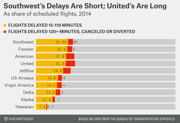
Source: fivethirtyeight
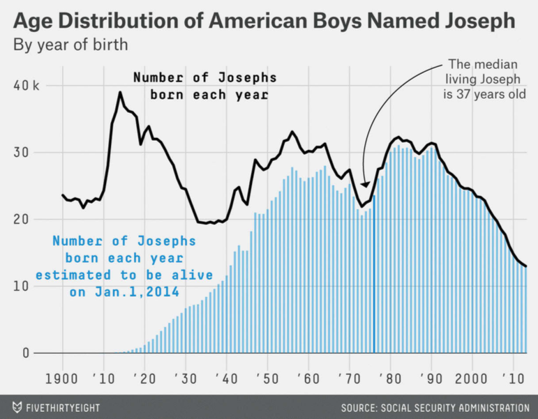
Source: fivethirtyeight
ggplot: All Your Figure are Belong to Us
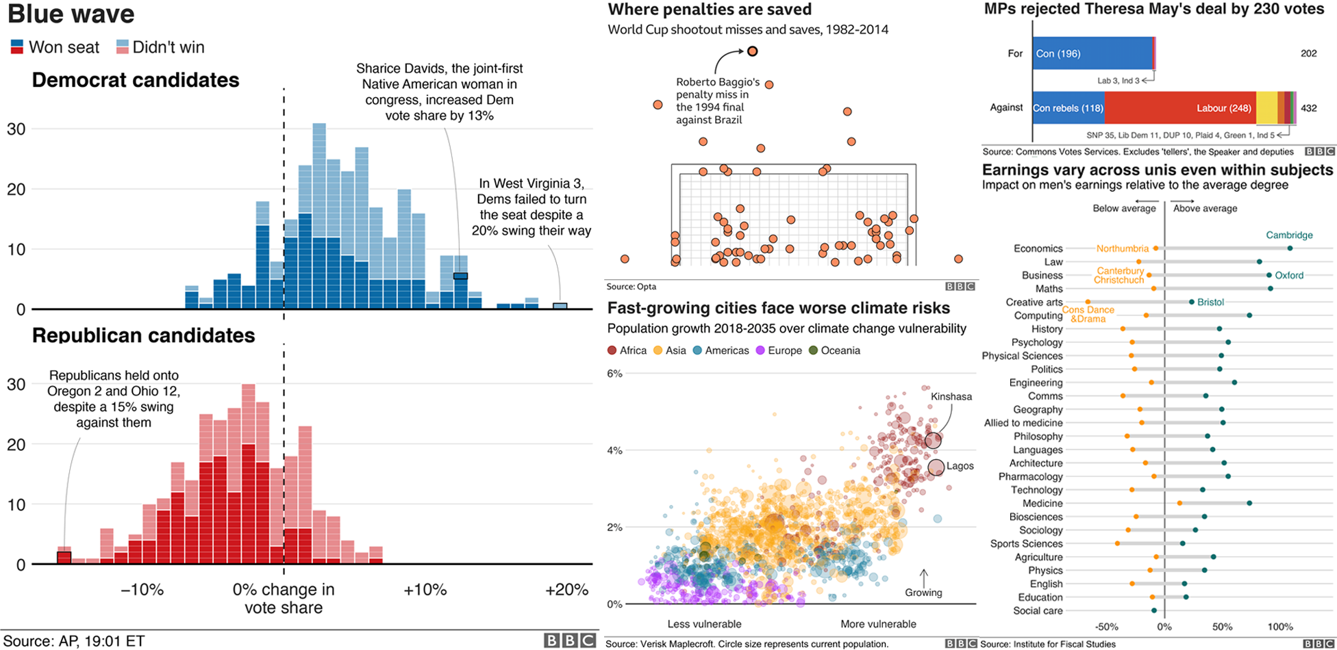
Source: BBC’s bbplot
Why Go gg?

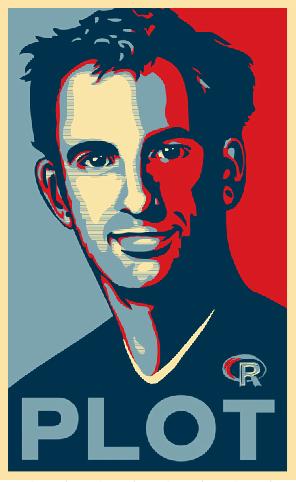
Hadley Wickham
Chief Scientist, R Studio
“The transferrable skills from ggplot2 are not the idiosyncracies of plotting syntax, but a powerful way of thinking about visualisation, as a way of mapping between variables and the visual properties of geometric objects that you can perceive.”
The Grammar of Graphics (gg)
This is a true grammar
We don’t talk about specific chart types
- That you have to hunt through in Excel and reshape your data to fit it
Instead we talk about specific chart components
The Grammar of Graphics (gg) I
- Any graphic can be built from the same components:
- Data to be drawn from
- Aesthetic mappings from data to some visual marking
- Geometric objects on the plot
- Scales define the range of values
- Coordinates to organize location
- Labels describe the scale and markings
- Facets group into subplots
- Themes style the plot elements
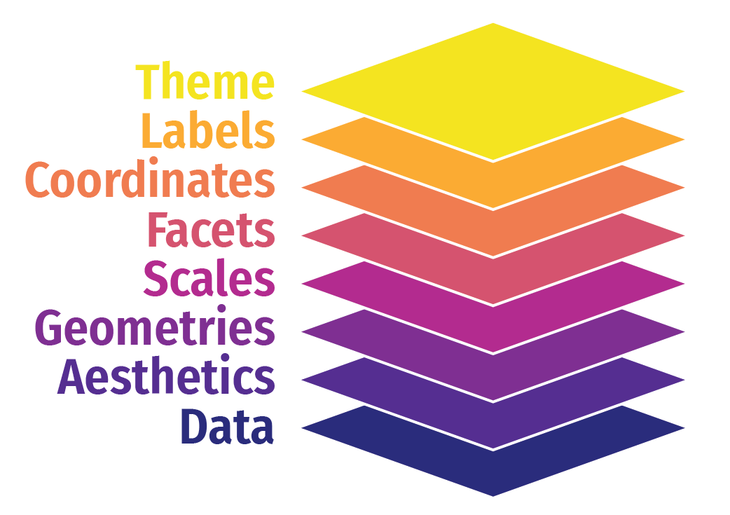
The Grammar of Graphics (gg) I
- Any graphic can be built from the same components:
datato be drawn fromaesthetic mappings from data to some visual markinggeometric objects on the plotscaledefine the range of valuescoordinates to organize locationlabelsdescribe the scale and markingsfacetgroup into subplotsthemestyle the plot elements
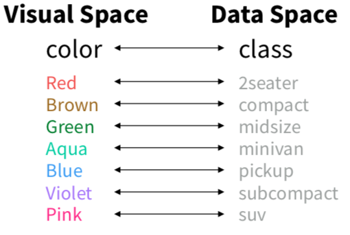
gg: Mapping Aesthetics I
Data
Aesthetics
+aes(...)
Aesthetics map data to visual elements or parameters
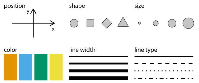
gg: Mapping Aesthetics IV
Data
Aesthetics
+aes(...)
Aesthetics map data to visual elements or parameters
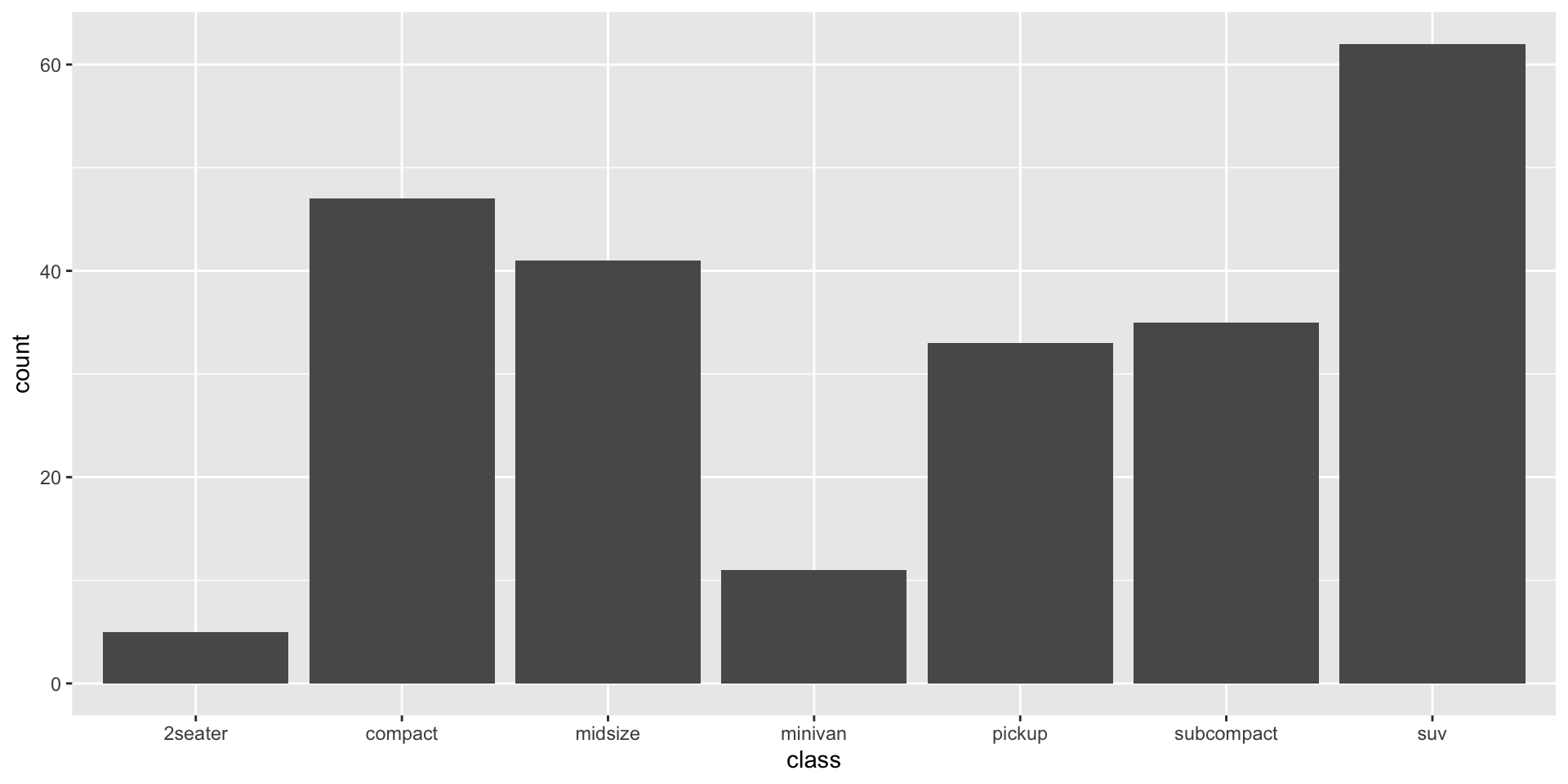
gg: Geoms I
Data
Aesthetics
Geoms
+geom_*(...)
Geometric objects displayed on the plot
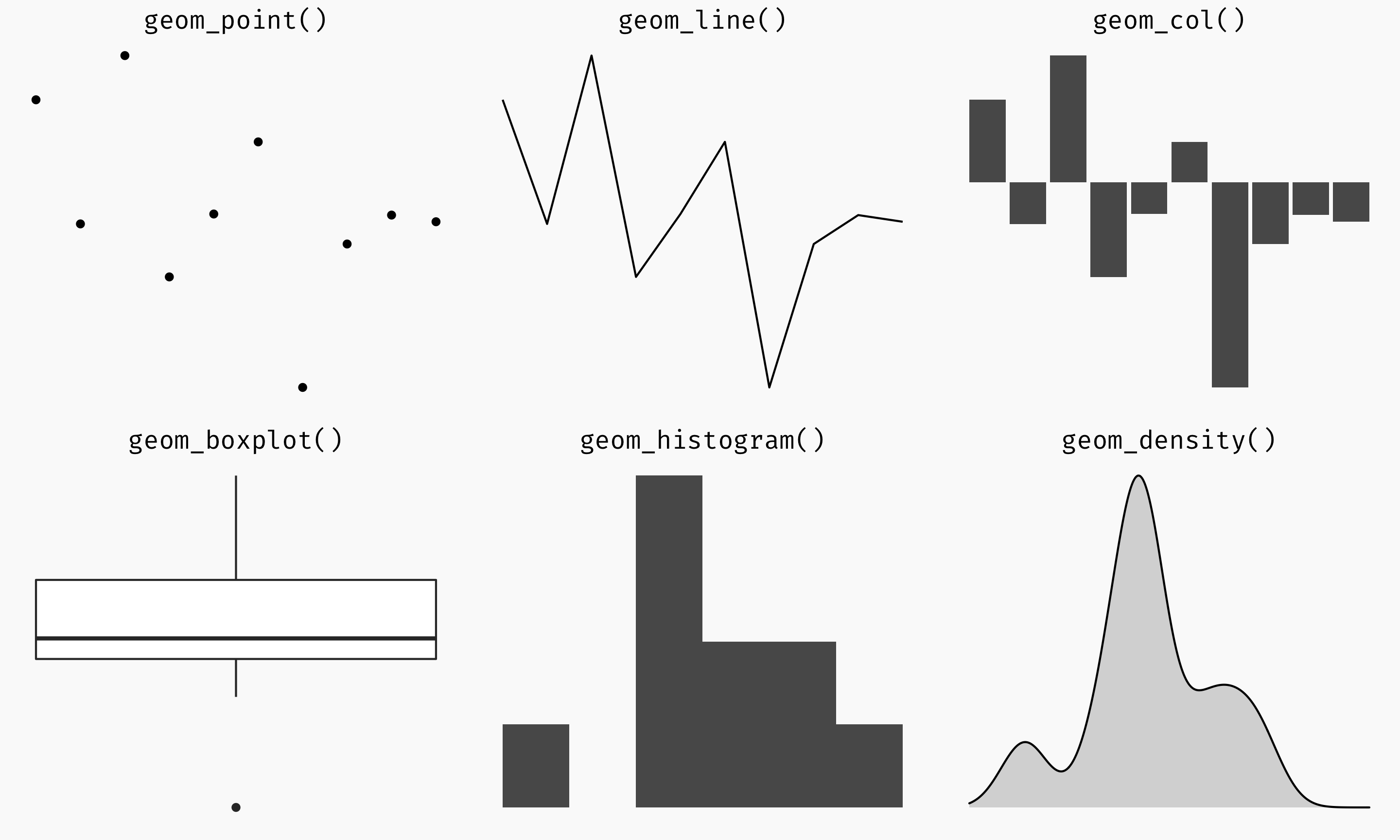
gg: Geoms IV
Data
Aesthetics
Geoms
+geom_*(...)
Geometric objects displayed on the plot
Or just start typing geom_ in R Studio!
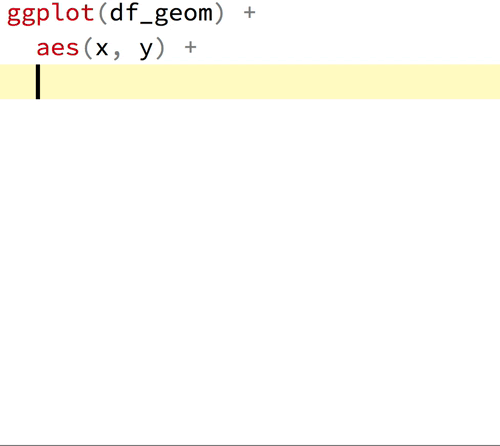
Let’s Make a Plot!

Let’s Make a Plot!
Let’s Make a Plot!
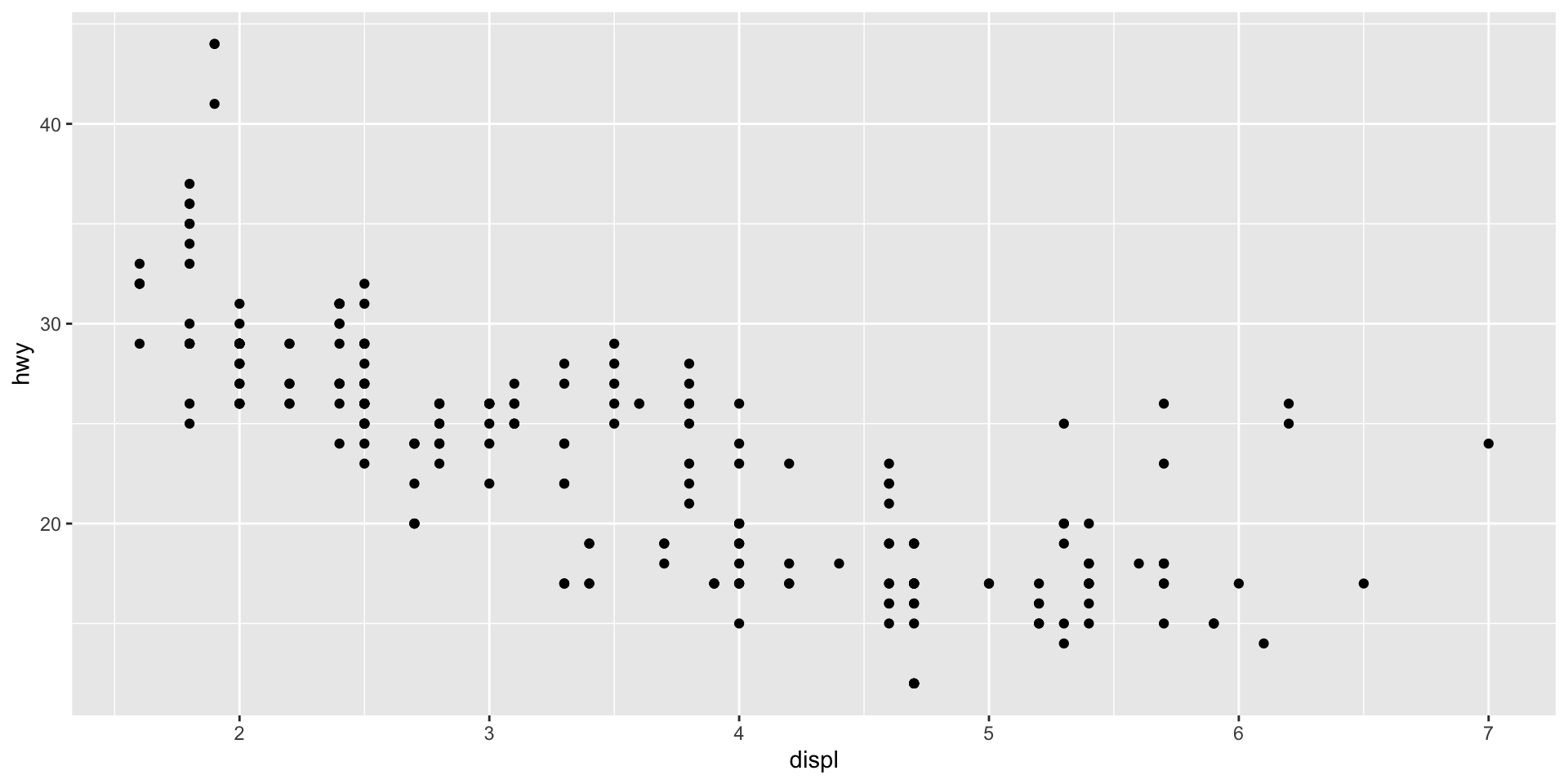
Let’s Make a Plot!
Let’s Make a Plot!
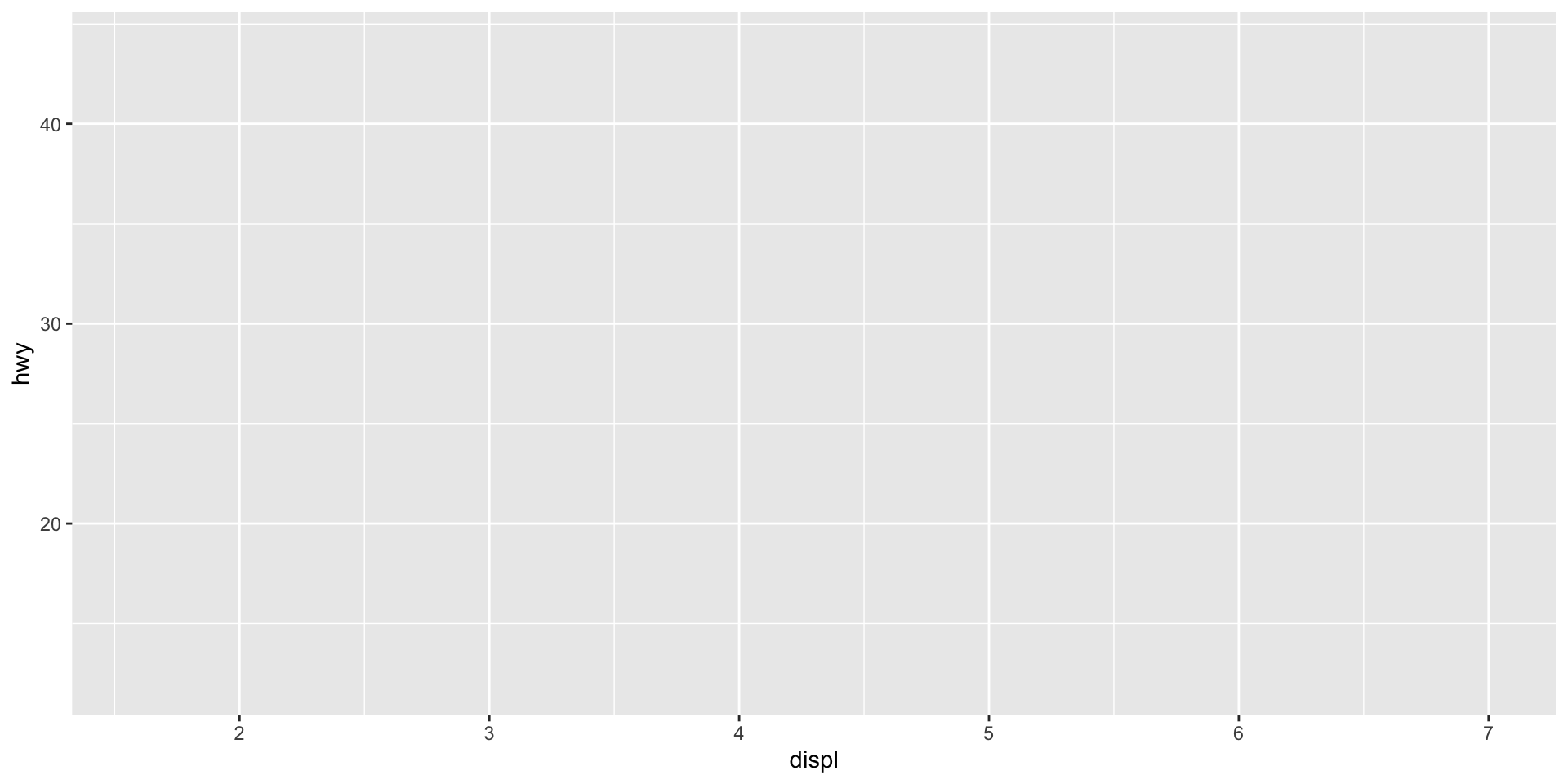
Our Plot

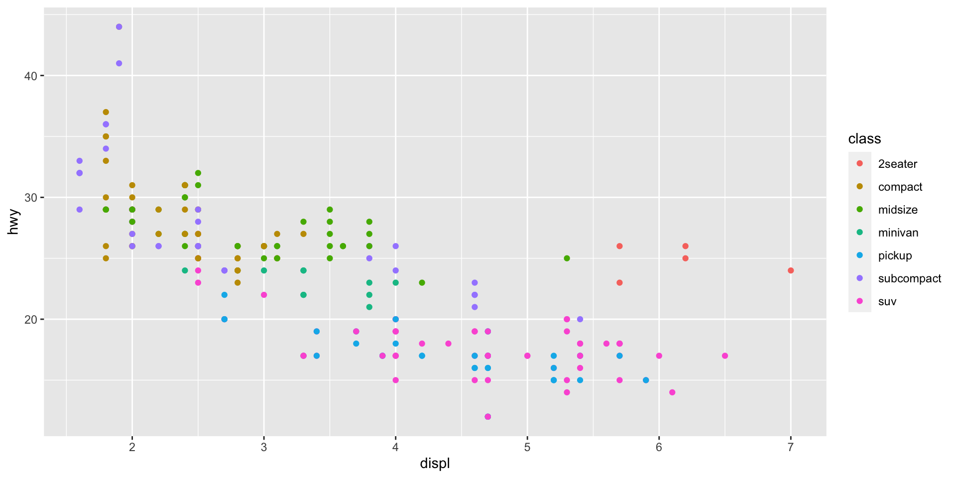
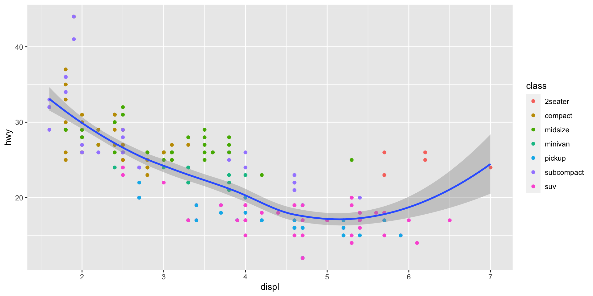
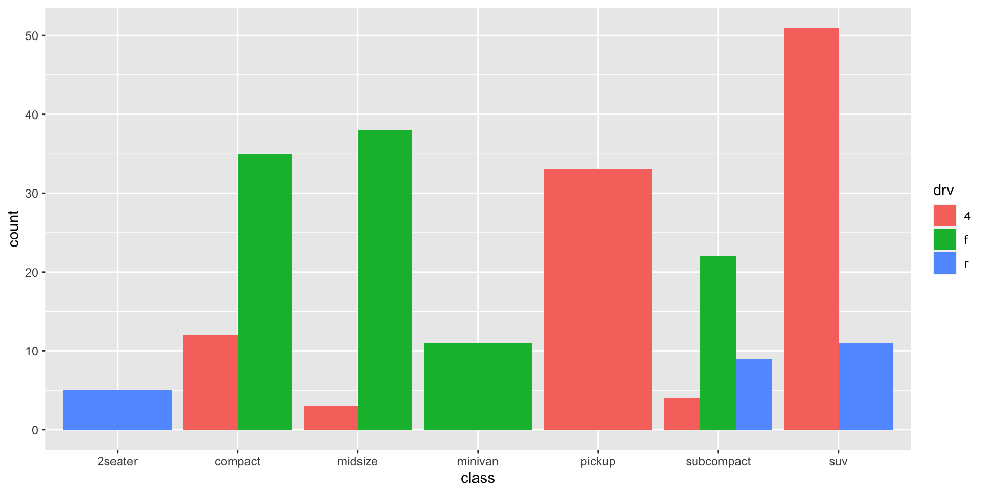
Change Our Plot
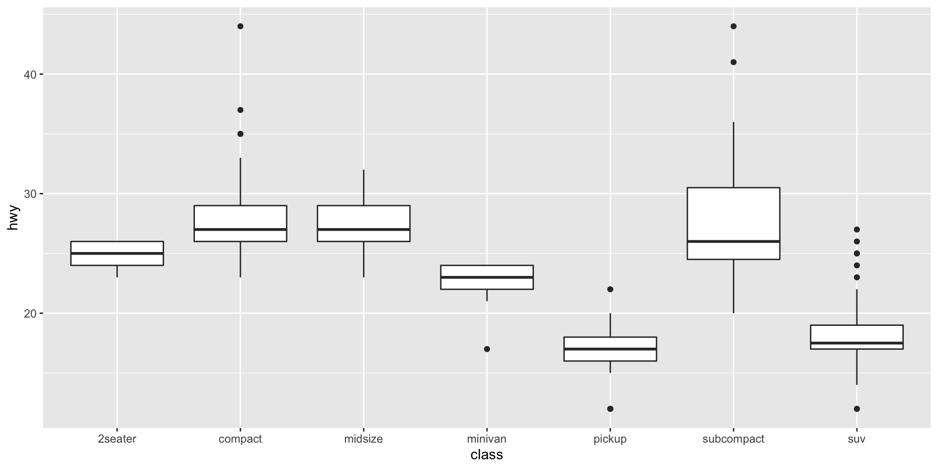
Change Our Plot
Change Our Plot
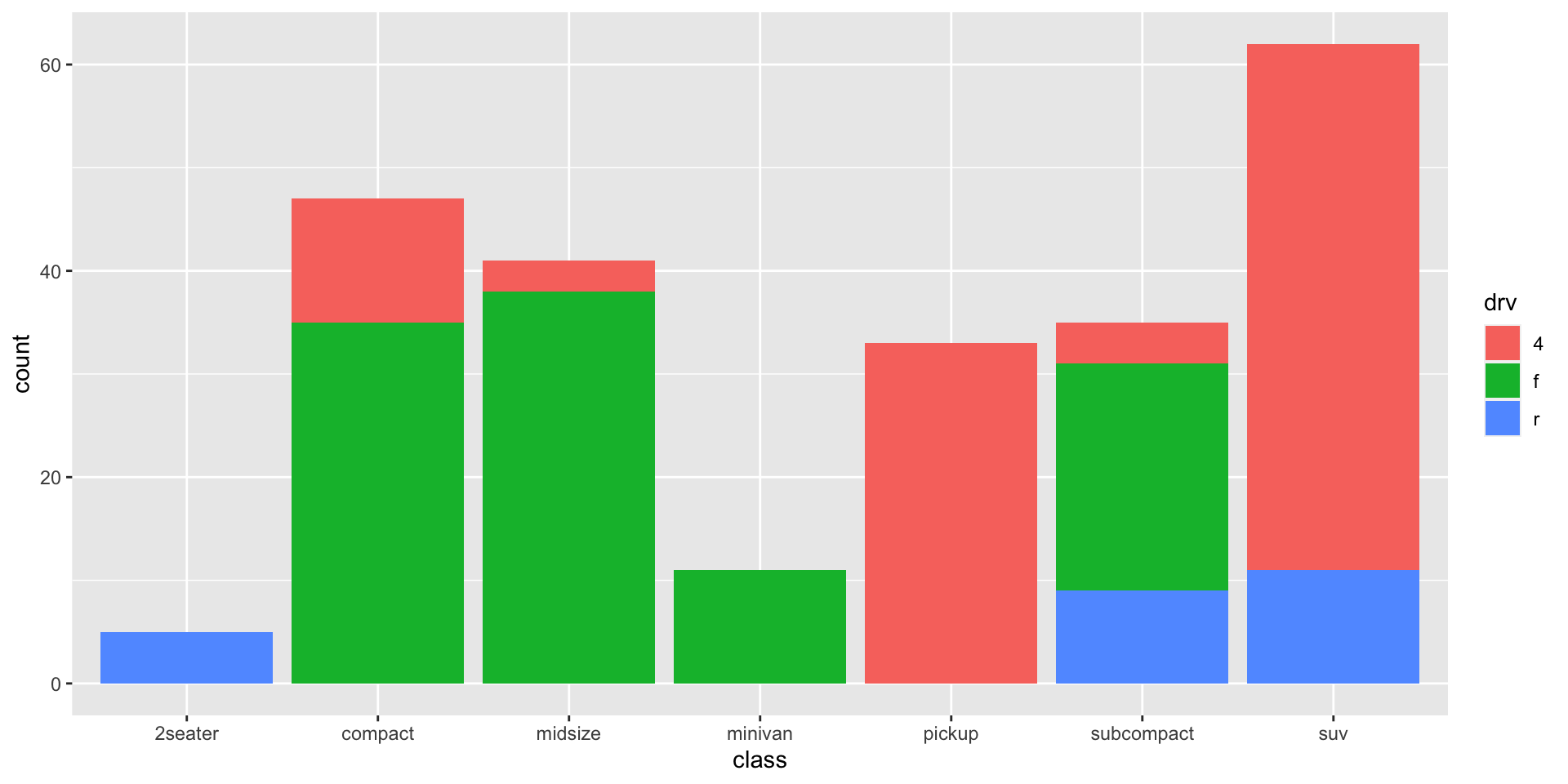
Change Our Plot
Back to the Original (and Saving It)

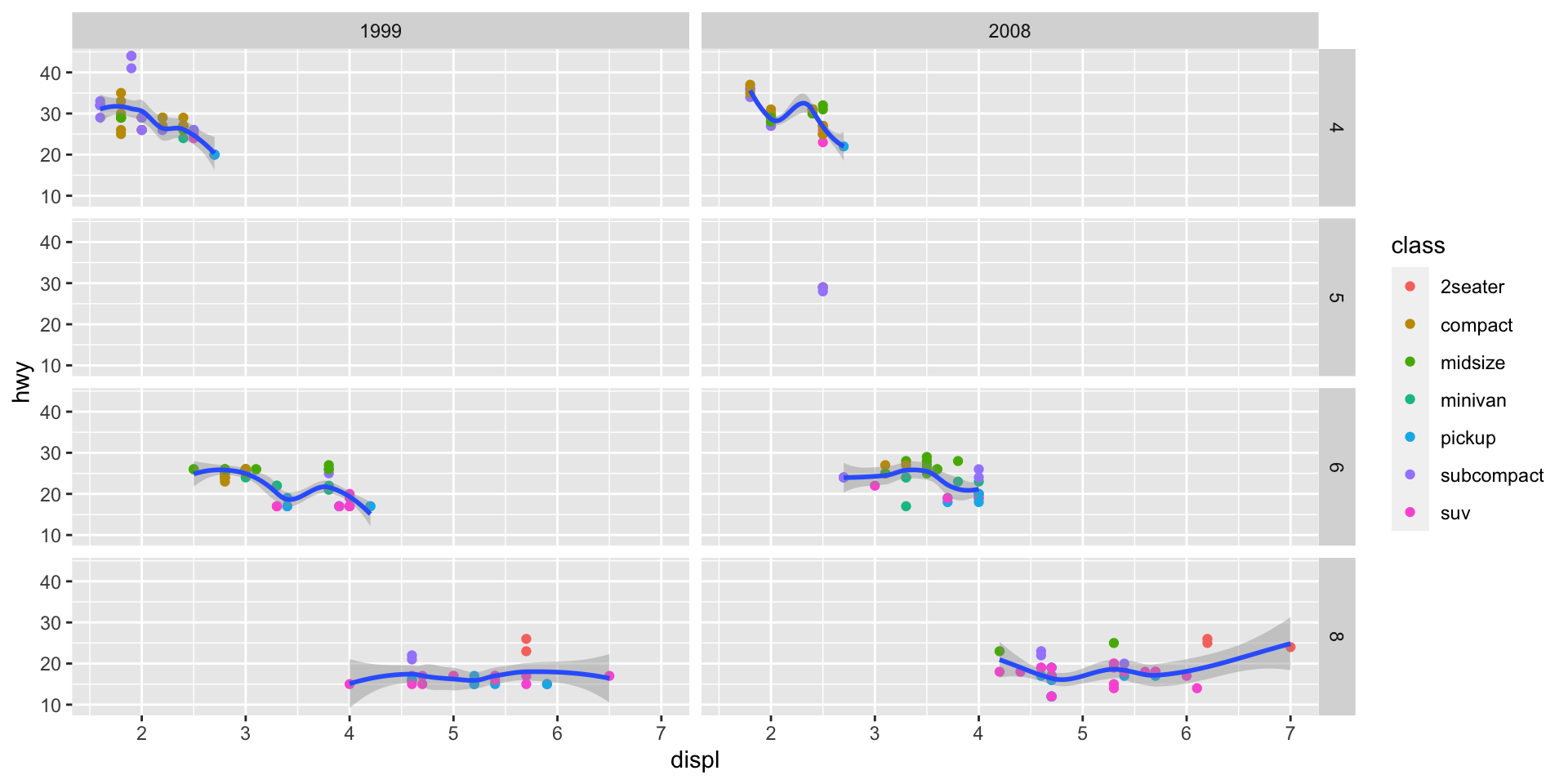
gg: Facets I
gg: Facets II
gg: Labels
gg: Scales II
gg: Scales II
gg: Themes III
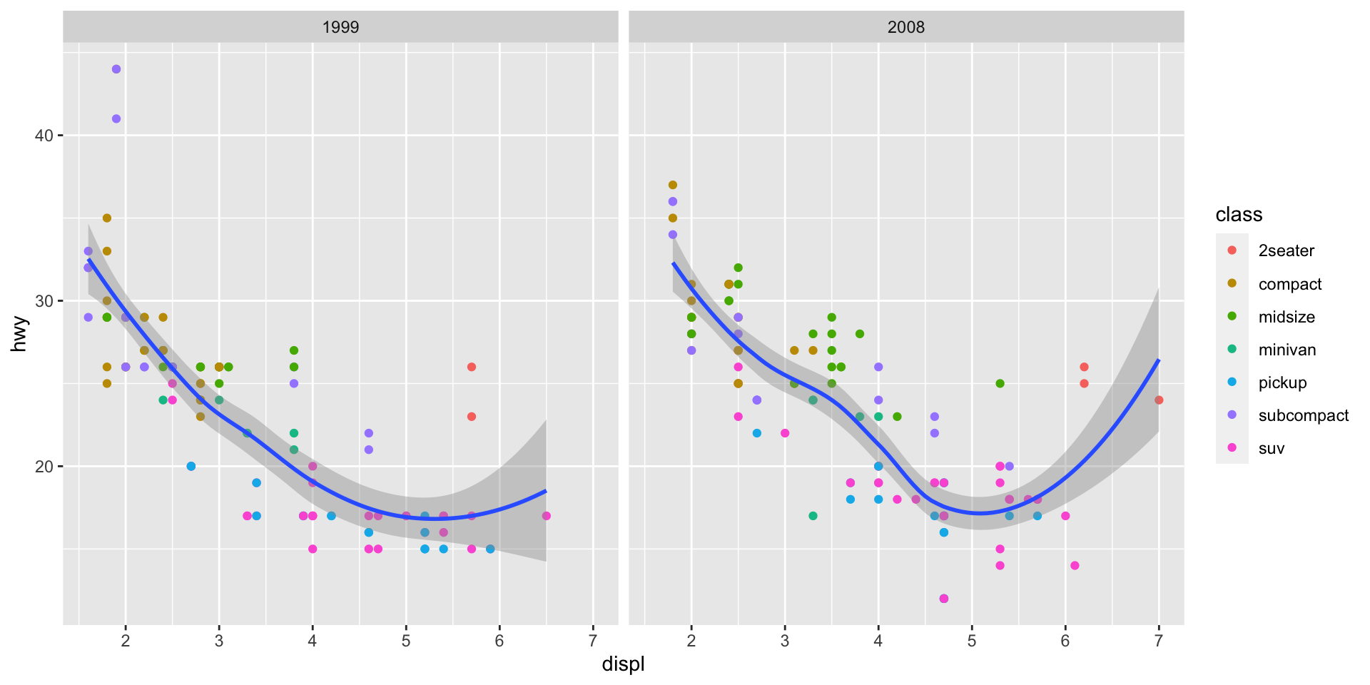
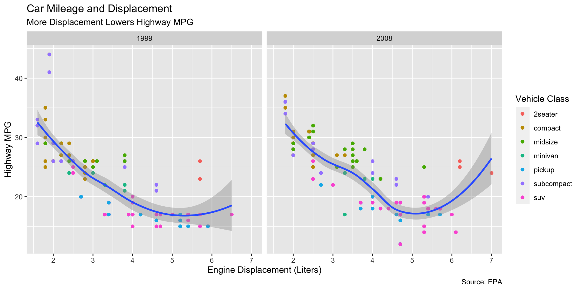
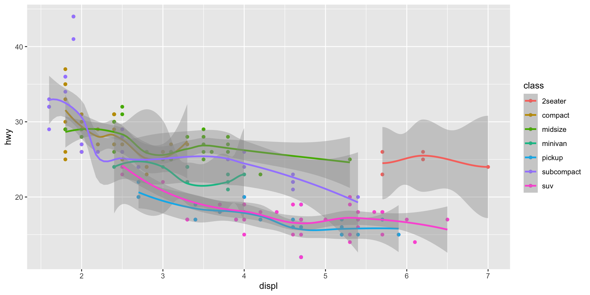
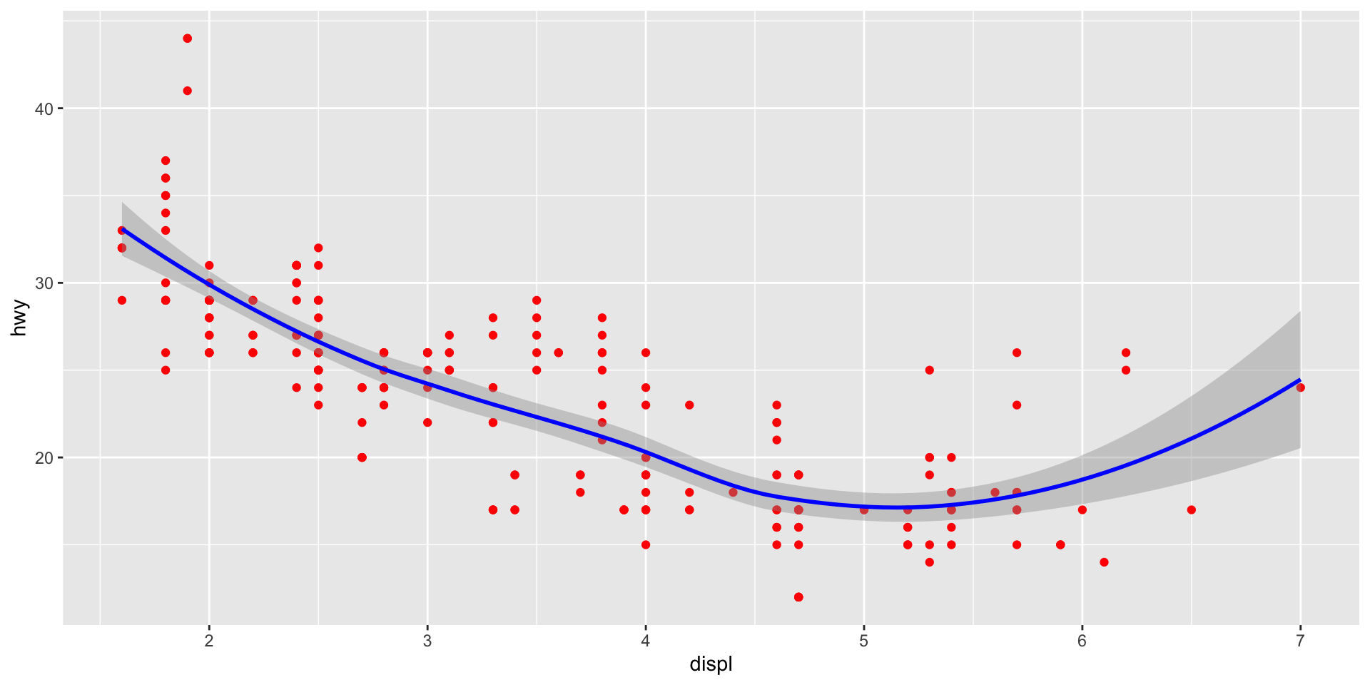
ggplot(data = mpg)+
  aes(x = displ,
y = hwy)+
geom_point(aes(color = class))+
geom_smooth()+
facet_wrap(~year)+
labs(x = "Engine Displacement (Liters)",
y = "Highway MPG",
title = "Car Mileage and Displacement",
subtitle = "More Displacement Lowers Highway MPG",
caption = "Source: EPA",
color = "Vehicle Class")+
scale_color_viridis_d()+
theme_minimal()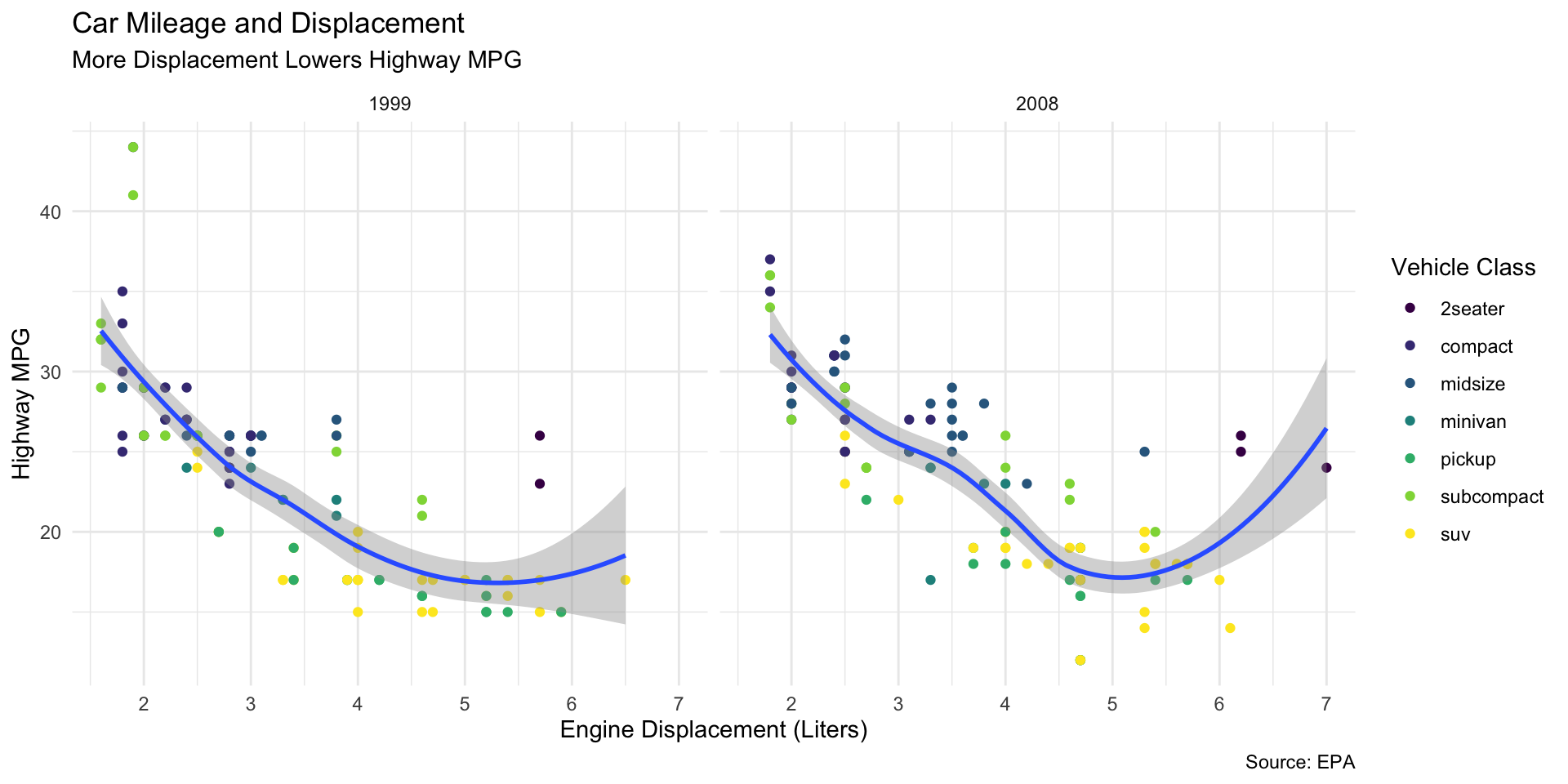
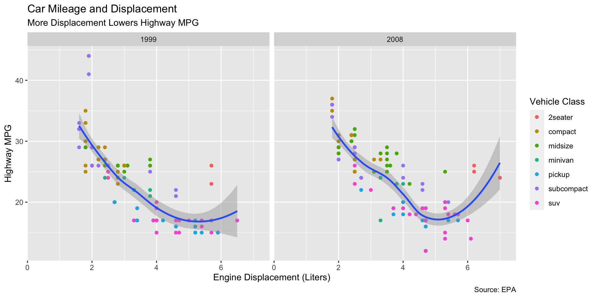
gg: Themes IV
ggplot(data = mpg)+
  aes(x = displ,
      y = hwy)+
geom_point(aes(color = class))+
geom_smooth()+
facet_wrap(~year)+
labs(x = "Engine Displacement (Liters)",
y = "Highway MPG",
title = "Car Mileage and Displacement",
subtitle = "More Displacement Lowers Highway MPG",
caption = "Source: EPA",
color = "Vehicle Class")+
scale_color_viridis_d()+
theme_minimal()+
theme(text = element_text(family = "Fira Sans"))
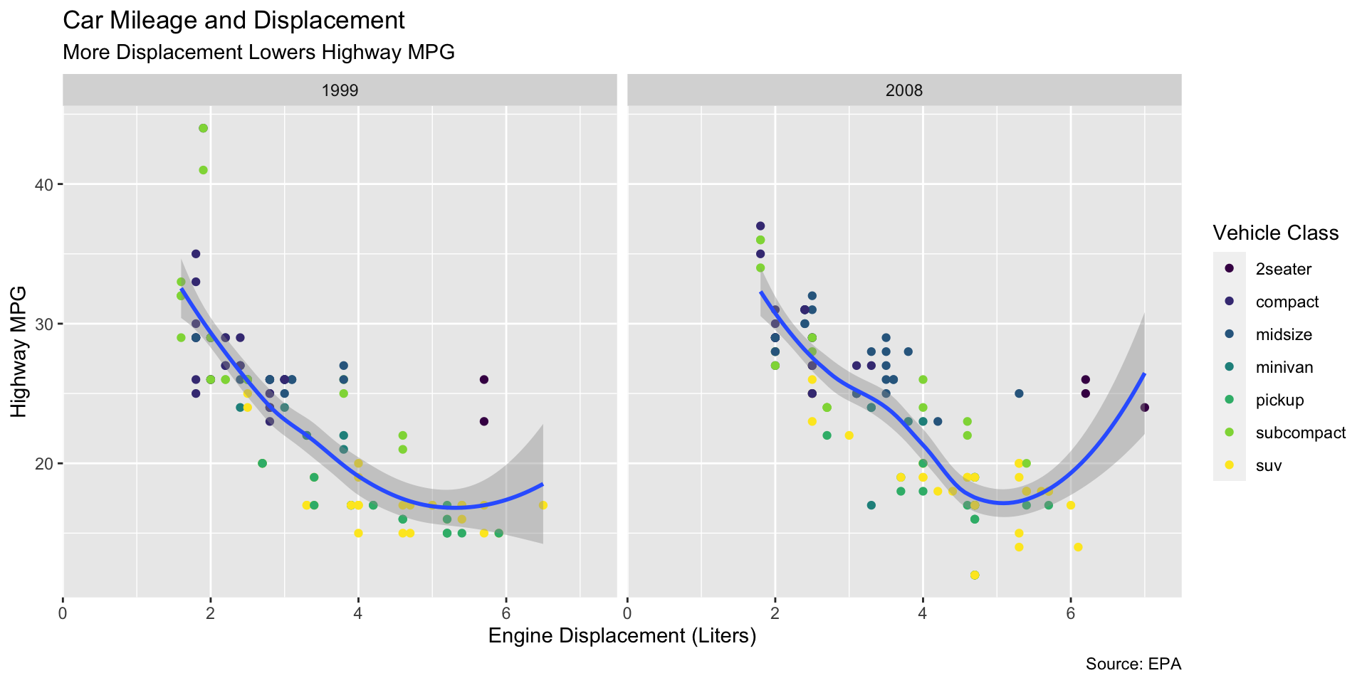
gg: Themes V
ggplot(data = mpg)+
  aes(x = displ,
      y = hwy)+
      geom_point(aes(color = class))+
geom_smooth()+
facet_wrap(~year)+
labs(x = "Engine Displacement (Liters)",
y = "Highway MPG",
title = "Car Mileage and Displacement",
subtitle = "More Displacement Lowers Highway MPG",
caption = "Source: EPA",
color = "Vehicle Class")+
scale_color_viridis_d()+
theme_minimal()+
theme(text = element_text(family = "Fira Sans"),
legend.position = "bottom")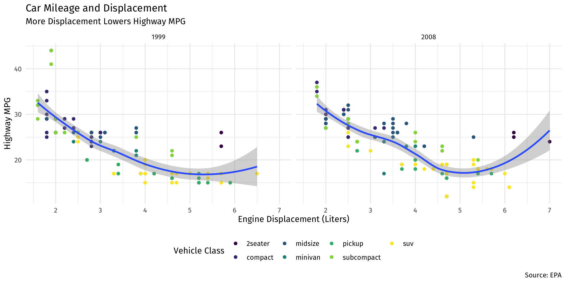
gg: Themes VII
library(ggthemes)
ggplot(data = mpg)+
  aes(x = displ,
      y = hwy)+
      geom_point(aes(color = class))+
geom_smooth()+
facet_wrap(~year)+
labs(x = "Engine Displacement (Liters)",
y = "Highway MPG",
title = "Car Mileage and Displacement",
subtitle = "More Displacement Lowers Highway MPG",
caption = "Source: EPA",
color = "Vehicle Class")+
scale_color_viridis_d()+
theme_economist()+
theme(text = element_text(family = "Fira Sans"))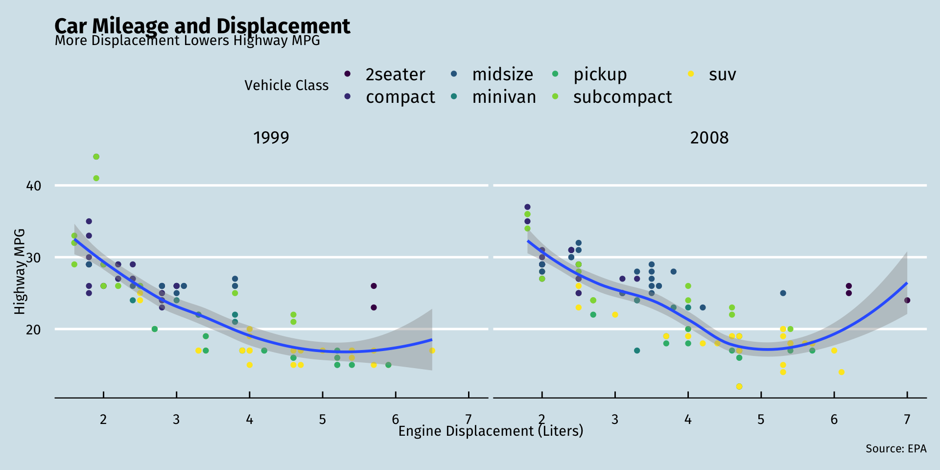
gg: Themes VIII
library(ggthemes)
ggplot(data = mpg)+
  aes(x = displ,
      y = hwy)+
  geom_point(aes(color = class))+
  geom_smooth()+
  facet_wrap(~year)+
  labs(x = "Engine Displacement (Liters)",
       y = "Highway MPG",
       title = "Car Mileage and Displacement",
       subtitle = "More Displacement Lowers Highway MPG",
       caption = "Source: EPA",
       color = "Vehicle Class")+
  scale_color_viridis_d()+
  theme_fivethirtyeight()+
  theme(text = element_text(family = "Fira Sans"))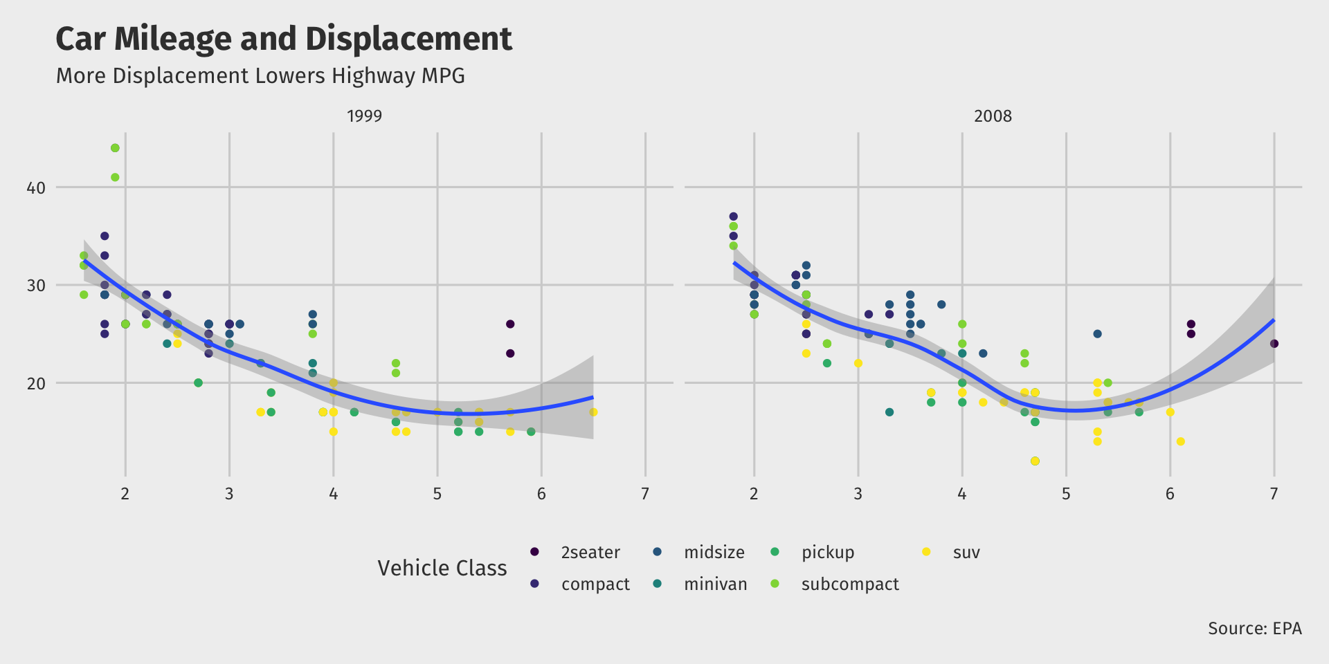
Global vs. Local Aesthetic Mappings
aes()can go in base (data) layer and/or in individualgeom()layers- All
geomswill inherit globalaesfromdatalayer unless overridden

Mapped vs. Set Aesthetics
aesthetics such assizeandcolorcan be mapped from data or set to a single value- Map inside of
aes(), set outside ofaes()

Go Crazy I
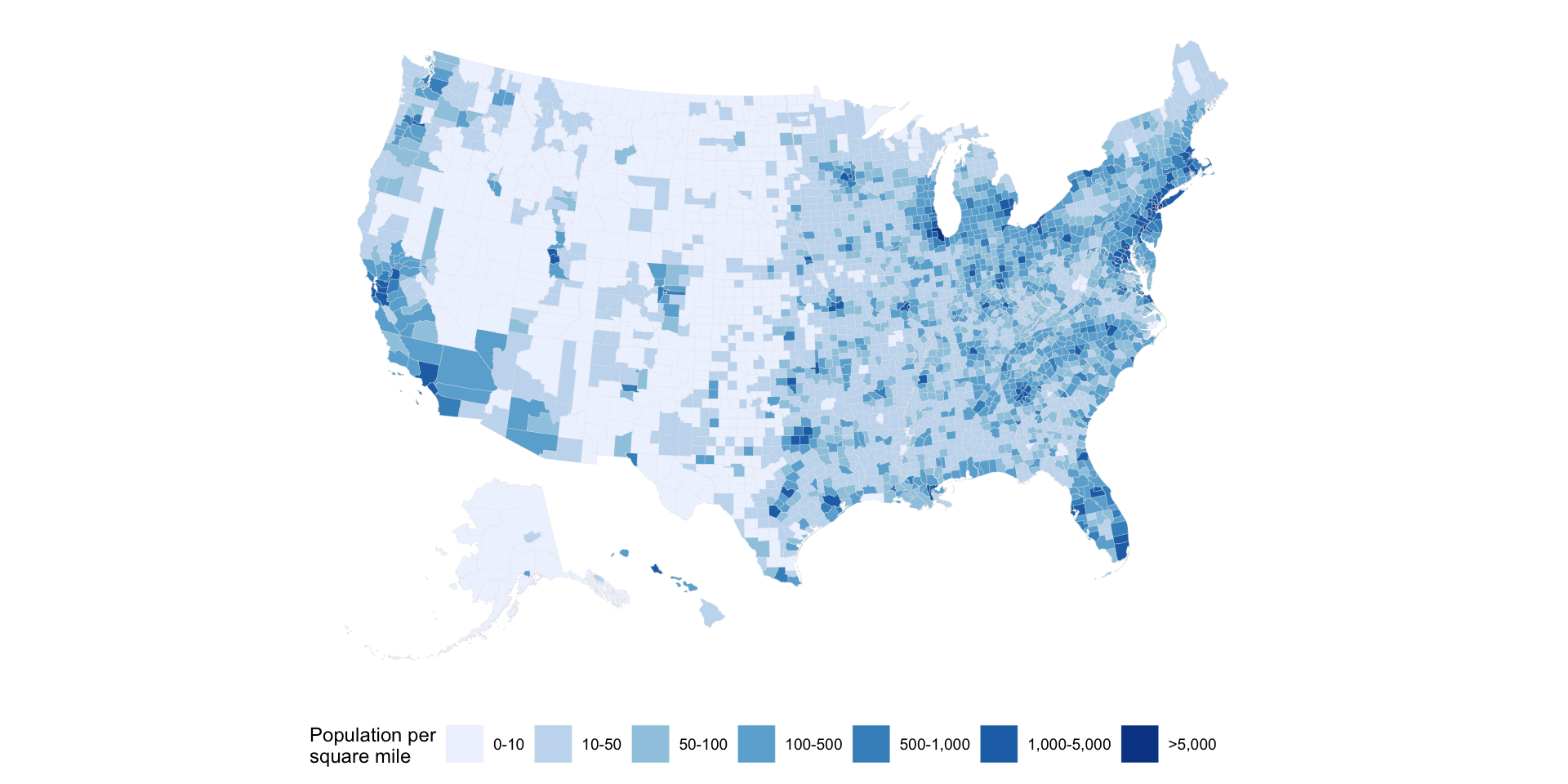
# I did some (hidden) data work before this!
ggplot(data = county_full,
            mapping = aes(x = long, y = lat,
                          fill = pop_dens,
                          group = group))+
  geom_polygon(color = "gray90", size = 0.05)+
  coord_equal()+
  scale_fill_brewer(palette="Blues",
                             labels = c("0-10", "10-50", "50-100", "100-500",
                                        "500-1,000", "1,000-5,000", ">5,000"))+
  labs(fill = "Population per\nsquare mile") +
    theme_map() +
    guides(fill = guide_legend(nrow = 1)) +
    theme(legend.position = "bottom")
Go Crazy II
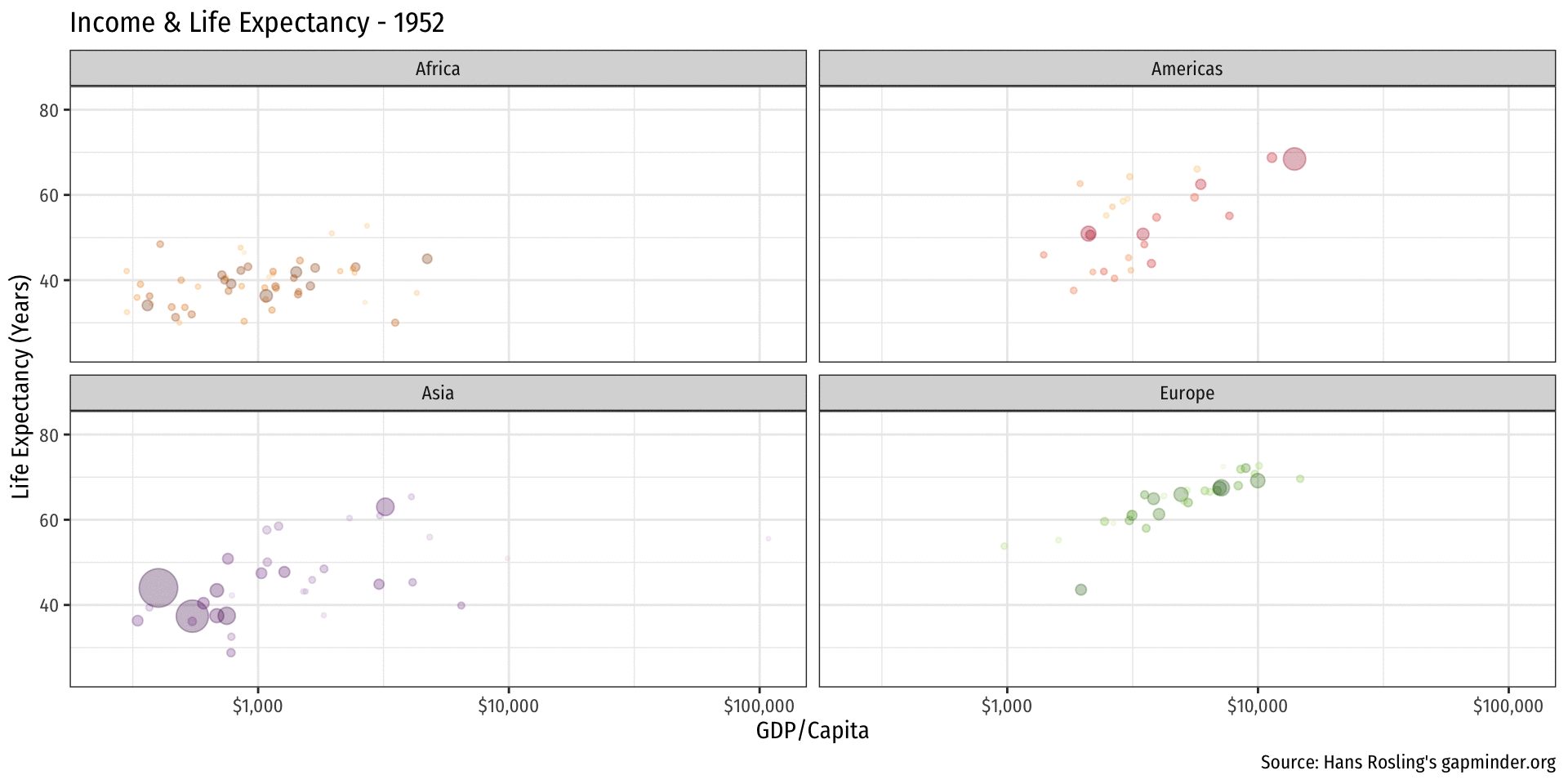
library(gapminder)
library(gganimate)
gapminder %>%
  filter(continent != "Oceania") %>%
ggplot(aes(x = gdpPercap,
           y = lifeExp,
           color = country,
           size = pop))+
  geom_point(alpha=0.3)+
    scale_x_log10(breaks=c(1000,10000, 100000),
                  label=scales::dollar)+
  scale_size(range = c(0.5, 12)) +
  scale_color_manual(values = gapminder::country_colors) +
    labs(x = "GDP/Capita",
         y = "Life Expectancy (Years)",
         caption = "Source: Hans Rosling's gapminder.org",
         title = "Income & Life Expectancy - {frame_time}")+
  facet_wrap(~continent)+
  guides(color = F, size = F)+
  theme_minimal(base_family = "Fira Sans Condensed")+
  transition_time(year)+
  ease_aes("linear")
Reference: R Studio Makes Great “Cheat Sheet”s!
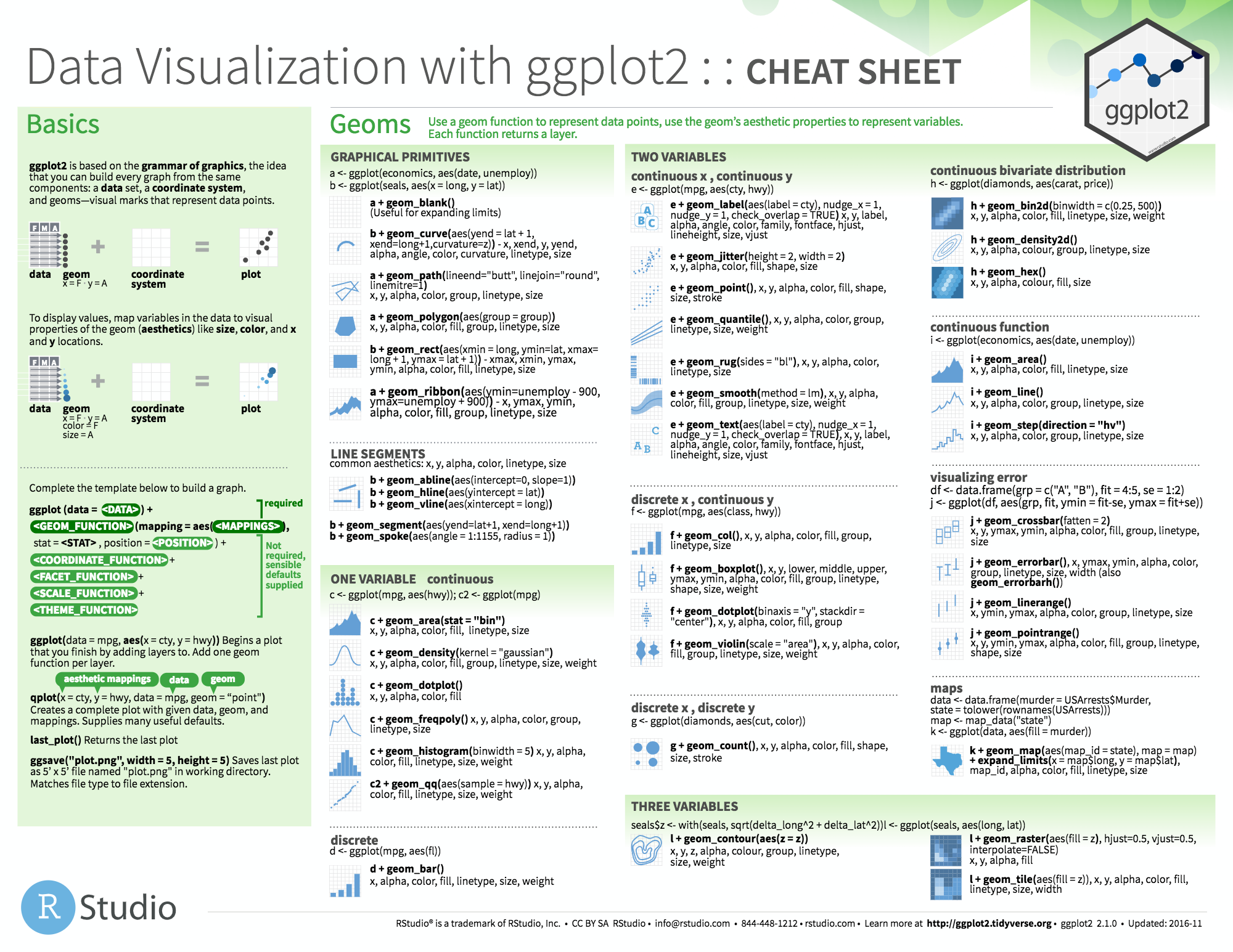
Reference
On ggplot2
- R Studio’s ggplot2 Cheat Sheet
ggplot2’s website reference section- Hadley Wickham’s R for Data Science book chapter on ggplot2
- STHDA’s be awesome in ggplot2
- r-statistic’s top 50 ggplot2 visualizations
On data visualization
- Kieran Healy’s Data Visualization: A Practical Guide
- Claus Wilke’s Fundamentals of Data Visualization
- PolicyViz Better Presentations
- Karl Broman’s How to Display Data Badly
- I Want Hue